<!DOCTYPE html PUBLIC "-//W3C//DTD XHTML 1.0
Transitional//EN" "http://www.w3.org/TR/xhtml1/DTD/xhtml1-transitional.dtd">
<html xmlns="http://www.w3.org/1999/xhtml">
<head>
<meta content="text/html; charset=utf-8" http-equiv="Content-Type" />
<title>無題 1</title>
<style type="text/css">
body {
margin:0;
padding:0;
border:0;
width:100%;
background:#F0F0F0;
min-width:600px; /* 最小幅 */
}
.colmask {
position:relative;
clear:both;
float:left;
width:100%; /* ページ全体幅 */
overflow:hidden;
}
.colright,
.colmid,
.colleft {
float:left;
width:100%;
position:relative;
}
.col1,
.col2,
.col3 {
float:left;
position:relative;
padding:0 0 1em 0;
overflow:hidden;
}
.fullpage {
background:#c1ffbf; /* ページ背景色 */
}
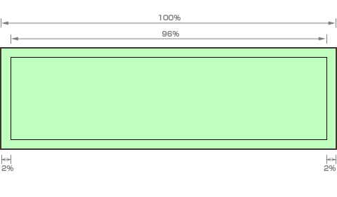
.fullpage .col1 {
width:96%; /* ページ幅 - ページ左右パディング */
left:2%; /* ページ左パディング */
}
</style>
</head>
<body>
<div class="colmask fullpage">
<div class="col1">
<!-- Column 1 start -->
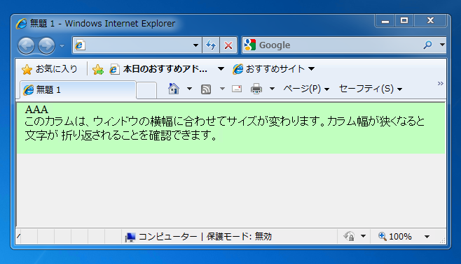
AAA
<br/>
このカラムは、ウィンドウの横幅に合わせてサイズが変わります。
カラム幅が狭くなると文字が 折り返されることを確認できます。
<!-- Column 1 end -->
</div>
</div>
</body>
</html>


